Two Styles, Two Different Ways of Thinking About Light
Blackwork and greywash aren't competing aesthetics. They're two distinct visual systems, each with its own logic of light, placement and longevity. Knowing the difference changes how you brief your artist.
By GoldSeam Editorial·14 July 2026
The Difference Isn't Preference. It's Structure.
Most people choose between blackwork and greywash the way they choose between two colours on a paint chart: one feels right, so they go with it. That instinct isn't wrong. But there's a layer beneath the feeling, a structural logic that shapes how a piece reads on your skin, how it holds over years, and whether the placement you want actually suits the style you've chosen.
Blackwork and greywash don't just look different. They think differently.
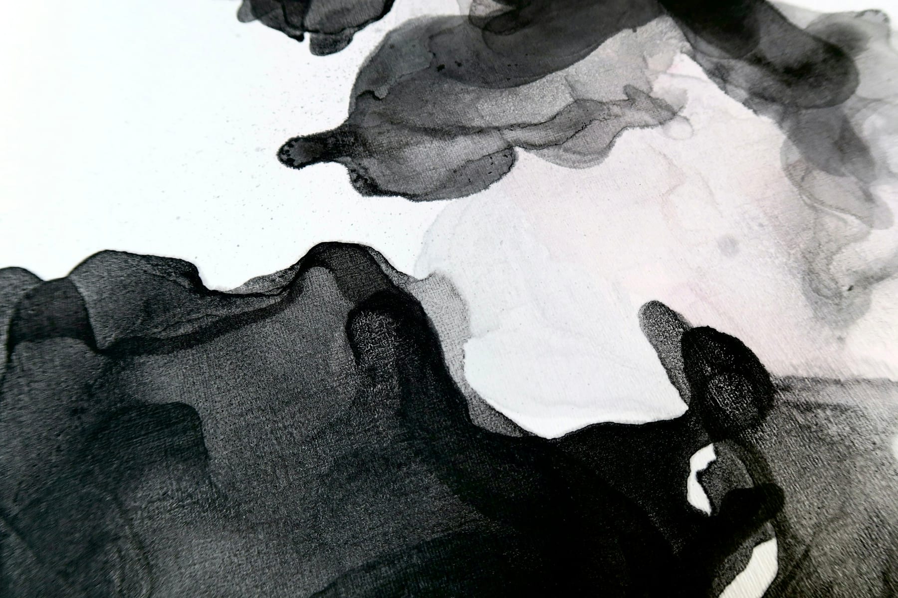
Blackwork works in absolutes. Solid fill, hard edges, no mid-tone. The eye reads it immediately. There's no graduation between the ink and your skin, only a clear threshold. That threshold is the composition. The contrast does all the structural weight-bearing, which is why a strong blackwork piece can land from across a room before you've processed a single detail.
Greywash works in degrees. Diluted ink is layered from near-white to near-black, building depth through incremental shift rather than hard boundary. The result is atmosphere, dimension, the suggestion of a light source on a flat surface. Shadow does the structural work here. Remove the shadow and the image collapses. It's a more fragile architecture, and a more technically demanding one.
Placement Follows the Logic
This distinction matters most when you're thinking about where the piece will live on your body.
Blackwork holds on high-movement areas. Forearm, shin, outer upper arm: places that flex, stretch and catch variable light throughout the day. The bold line and solid fill survive those conditions. The contrast stays legible even as the skin moves and the light shifts. You're not relying on subtle tonal relationships that a shadow or a crease can disrupt.
Greywash rewards stillness. Sternum, thigh, back panels: broad surfaces with relatively consistent light and less mechanical stress. These are the placements where delicate tonal transitions can actually be read. On a surface that folds and flexes constantly, a finely graded greywash can lose its coherence. The structure softens before its time.
This doesn't mean you can't put greywash on your arm or blackwork on your back. It means the placement should inform the style choice, not follow it.
How Each Style Ages
Both styles change over time. The question is whether you understand what you're signing up for.
Blackwork retains its shape as ink settles into the skin. The edges may soften marginally over years, but the contrast that defines the piece holds. What you see at six months is close to what you'll see at fifteen years. That's the durability argument.
Greywash softens with age. The finest gradations become less distinct. This is not a flaw; it's a known quality of the medium, and an honest artist will tell you so upfront. A well-executed greywash piece deepens with age rather than blurs. The key word is well-executed: tight technical application and appropriate placement are what separate a piece that matures gracefully from one that loses definition too soon.
Both styles reward an experienced hand. For different reasons. Blackwork demands precision in line weight and fill consistency. Greywash demands control of dilution, layering sequence and tonal range.
The Question to Ask Before You Sit Down
Before you walk into a consultation with a reference image and a placement in mind, ask yourself one thing: what does this piece need to do?
Bold and immediate, readable from a distance, structurally durable across decades? The logic points toward blackwork. Layered and atmospheric, built from light inward, detailed in a way that rewards close attention? That's greywash.
The style should match the intention. Not the trend, not the artist's portfolio aesthetic alone, not the last thing you saved. When the intention is clear, the right visual system tends to become obvious. And that's where the conversation with your artist gets interesting.
The gold is in the seam.